
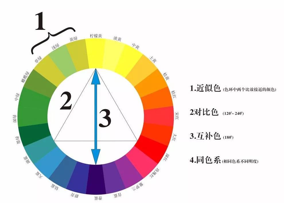
Common color ring color scheme, color ring color scheme
Mixing the three primary colors produces purple, clear, and green, and then mixing to produce more compound colors, forming the well-known "color circle".
Next, let's take a look at the common ones in PhotoshopH (hue), S (purity), V (B brightness):
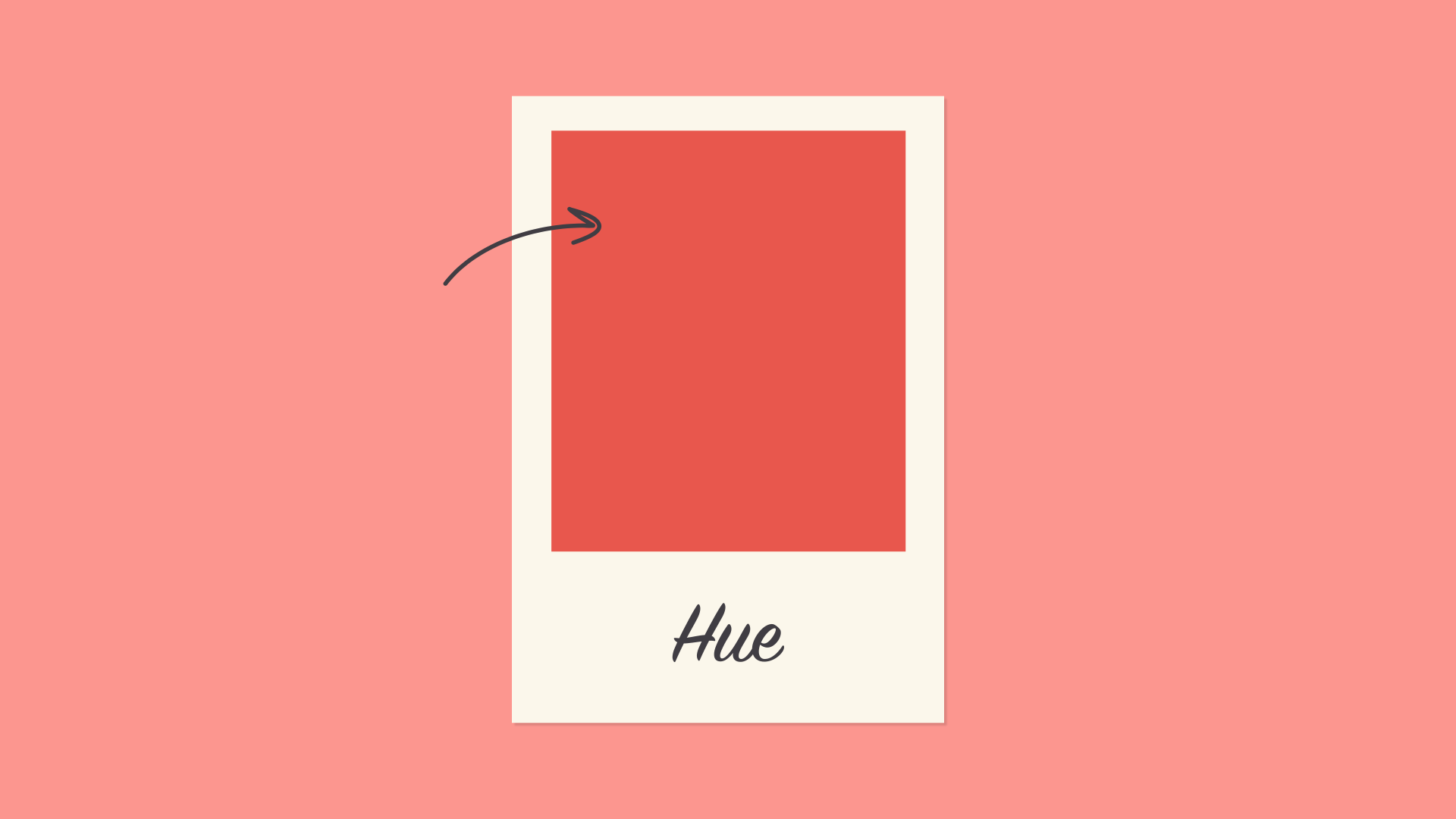
H hue:Hue is the easiest; it's basically just another name for color. In the example below, depending on your explanation, you can describe its hue as coral pink or light red.
S saturation (purity):Saturation refers to intensity, or whether a color appears lighter or brighter. High-saturation colors are brighter or richer. Unsaturated colors have less pigment and therefore have lower brightness.

V (B) Brightness:Lightness is related to how dark or light the color is, from black to white. As you can see below, this gives us a lot of different grey releases, from deep reddish brown to light pink.

Common color scheme
monochrome
The simplest coordination formula is monochrome because it uses only one color or hue. To create a monochromatic color scheme, pick a point on the color wheel and use your knowledge of saturation and lightness to create variations.
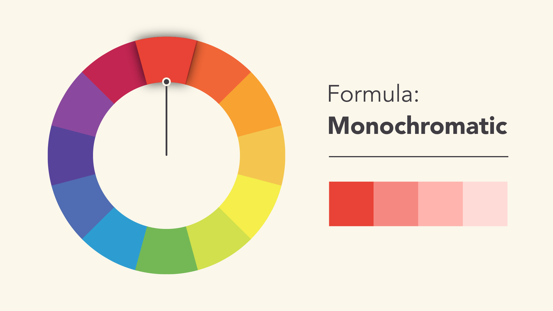
The best thing about monochrome color schemes is that they match. The colors fit perfectly because they all come from the same family.
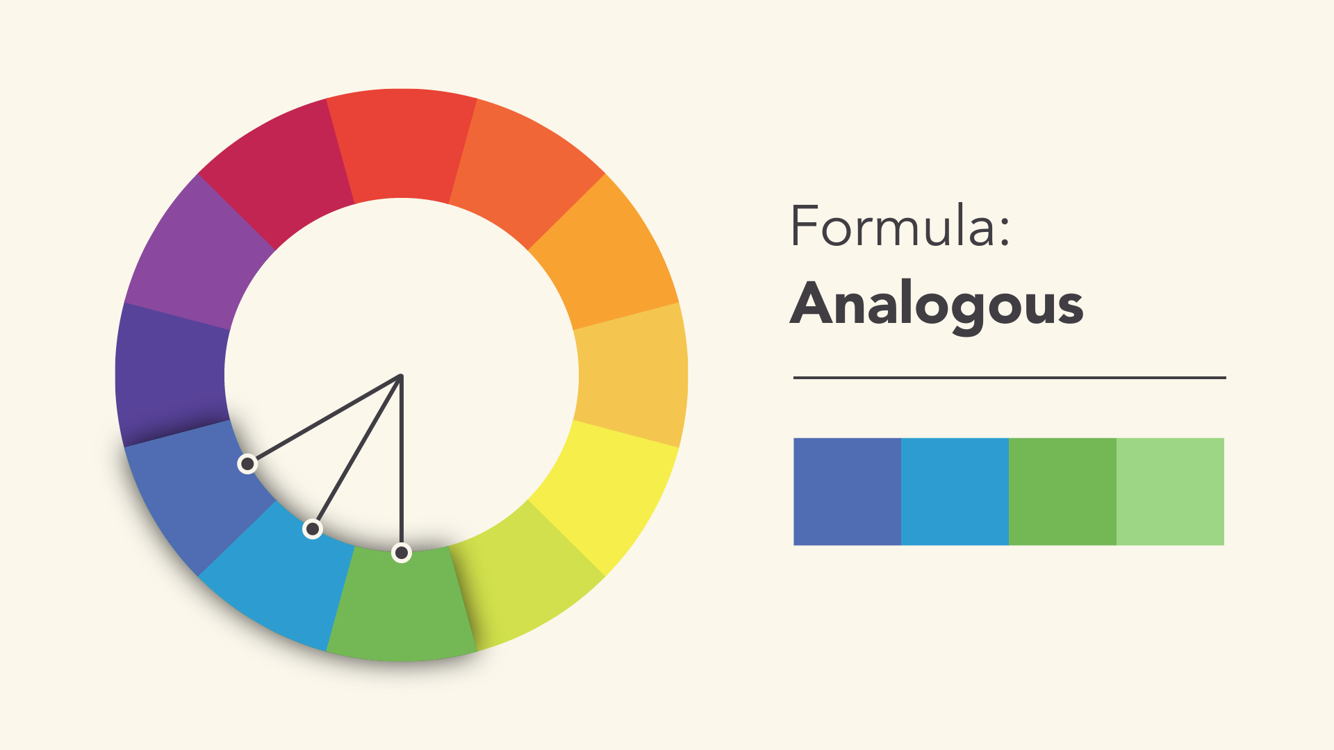
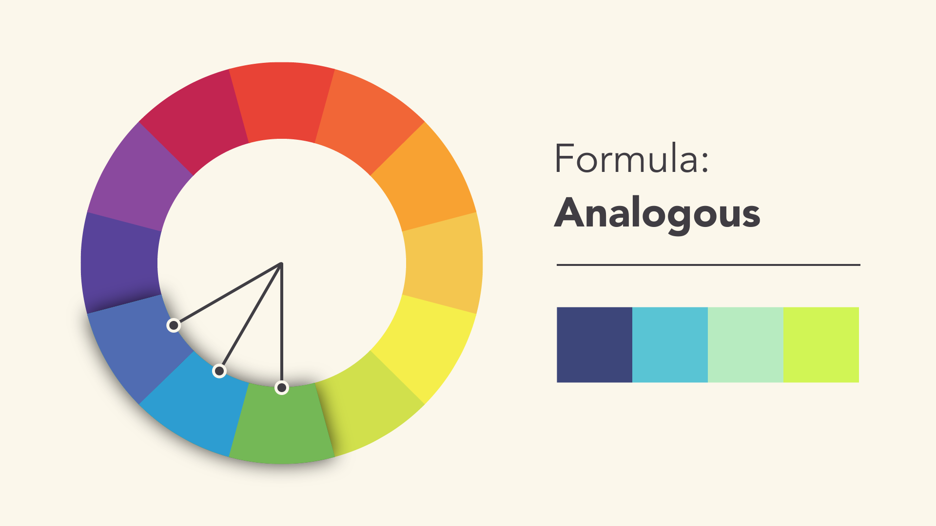
similar color
Similar color schemes use colors that are adjacent to each other on the color wheel, such as red and orange or blue and green.
Don't be afraid to use color palettes and create your own unique interpretation. That's what color coordination is all about; formulas are just the starting point to help guide and inspire you.
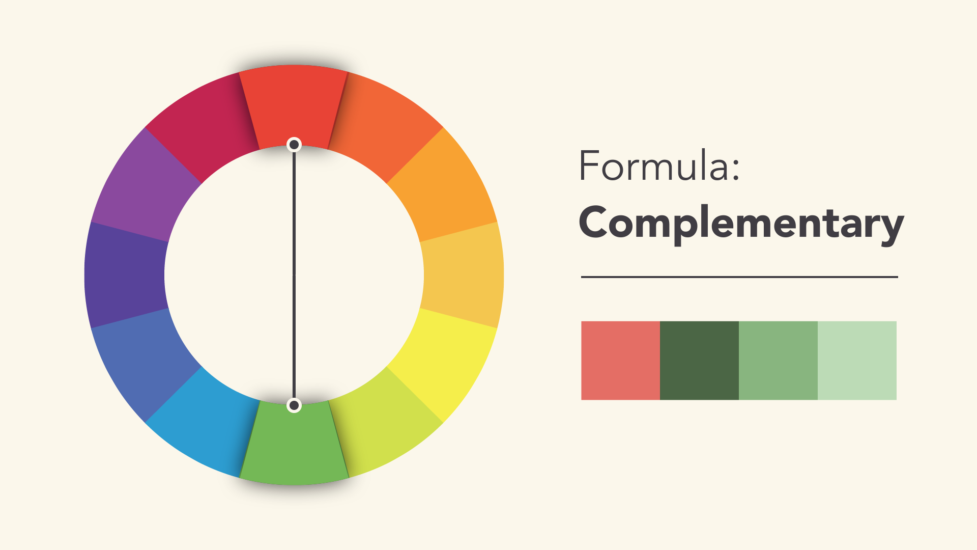
complementary color
Complementary colors are opposites on the color wheel; for example, blue and orange or the classic red and green.
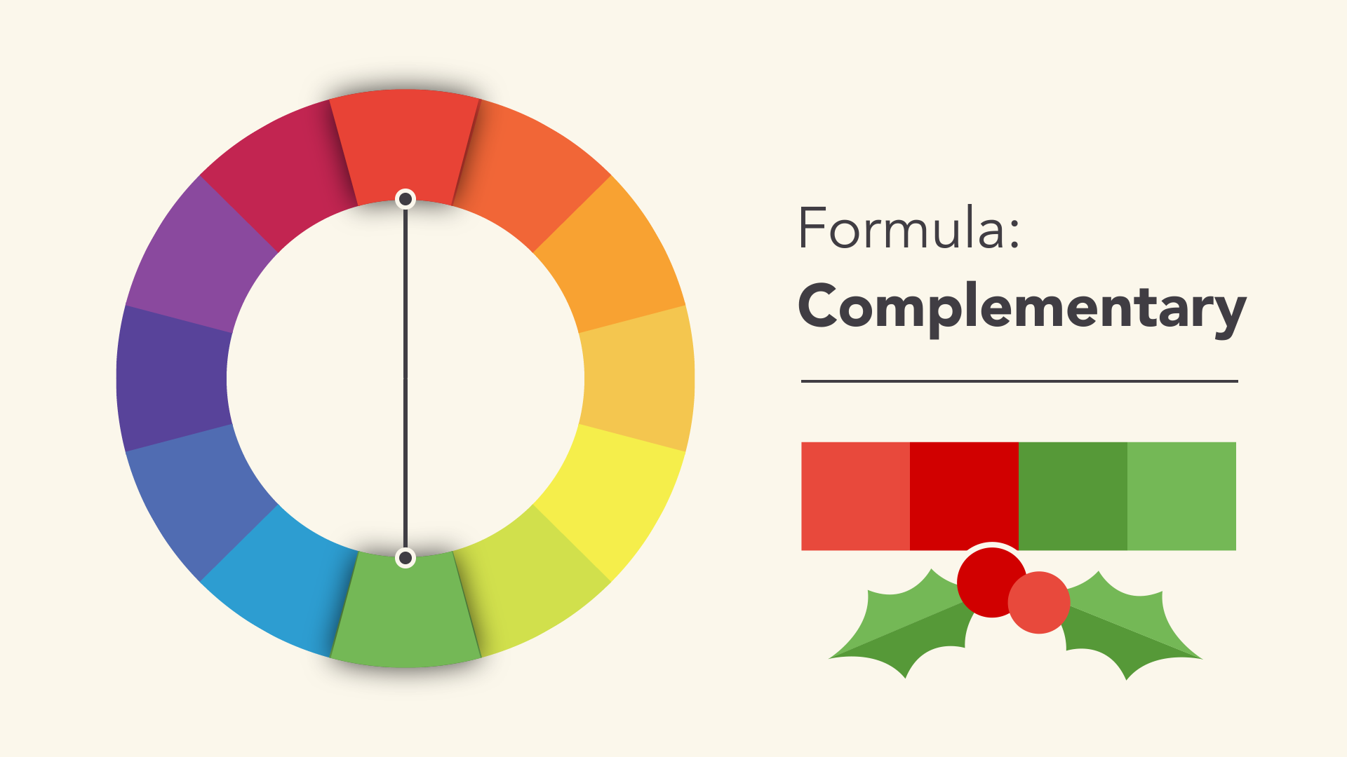
To avoid overly simplistic complementary color schemes, add some variation by introducing lighter, darker or unsaturated hues.
Split complementary colors
Split complementary color schemes using colors on both sides of complementary colors.
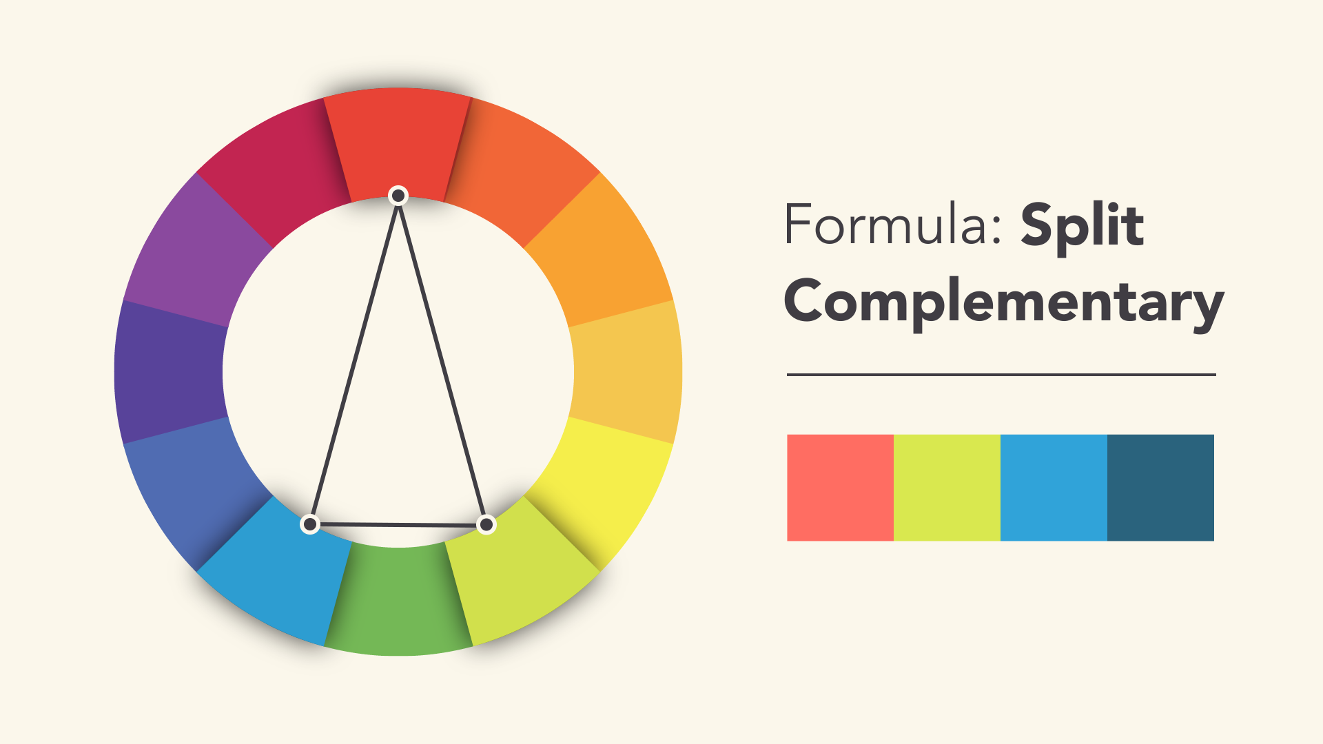
This will allow you to achieve the same contrast as the complementary color scheme, but with more colors (and potentially more interesting results).
ternary color
A ternary color scheme uses three evenly spaced colors that form a perfect triangle on the color wheel.
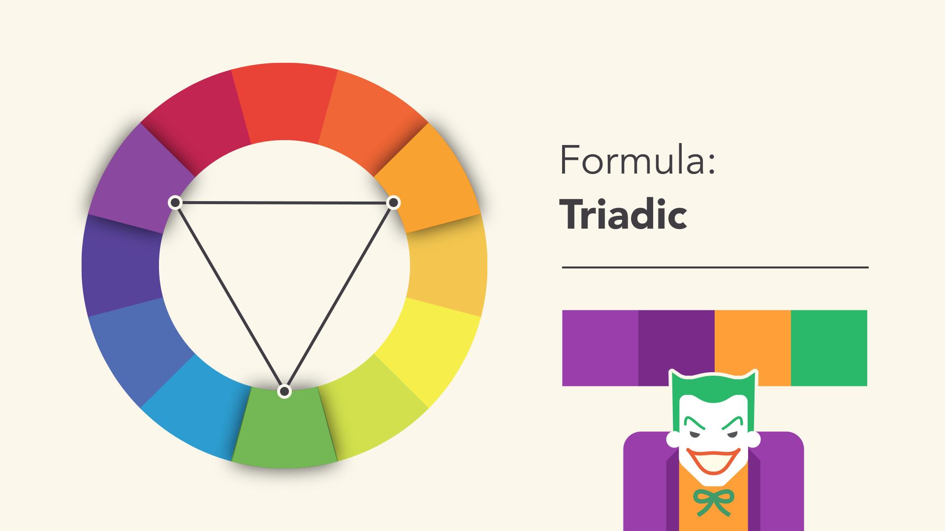
These combinations are often very striking, especially when they contain primary or secondary colors, so be careful when using them in your work.
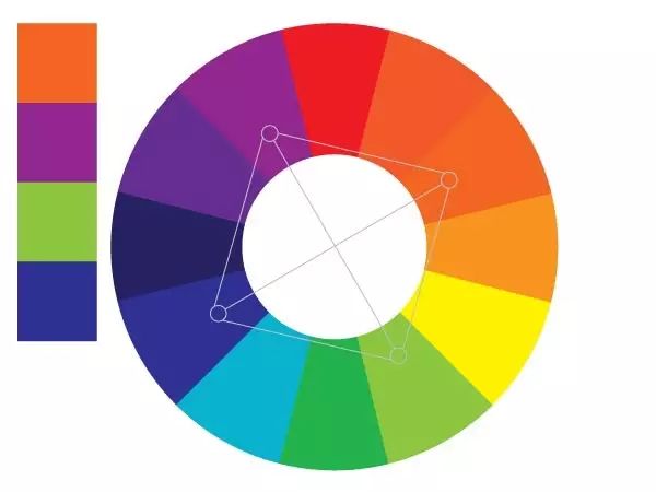
Quaternary
A quaternary color scheme forms a rectangle on the color wheel, using not one but two pairs of complementary colors. This scheme works best if you let one color dominate and the others act as accent colors.
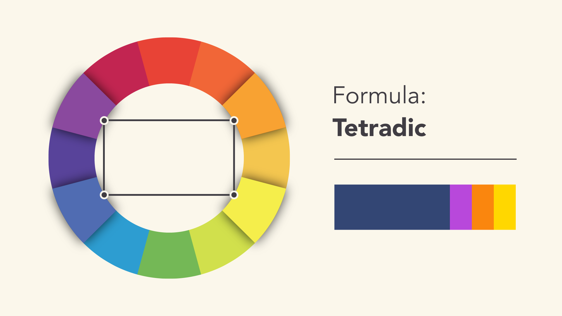
Foursquare color
Avoid common mistakes
There are some classic dos and don'ts when it comes to color. For example, have you ever seen colors put together to seem to vibrate?

The solution is to darken it literally, and there's an easy way. Start with a color and try adjusting its brightness, darkness, or saturation. Sometimes, a little bit of contrast is all you need for your color scheme.

Readability is an important factor in any design. Your colors should be legible, especially when working with text.
Sometimes that means not using color, at least not in every detail.
Neutral colors such as black, white, and gray can help balance your design, so when you真正使用颜色时,它能真正脱颖而出。
Find inspiration
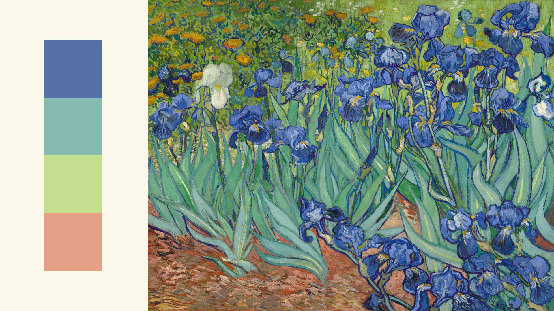
You can find color scheme ideas in a variety of interesting places, from advertising and branding to famous artworks.
You can even use web resources to browse color scheme cards or generate your own color scheme cards.
Experienced designers often draw inspiration from the world around them. There's nothing wrong with finding something you love and making it your own.
(Reprinted from GCFGlobal)
en配色网 » Common color ring color scheme, color ring color scheme